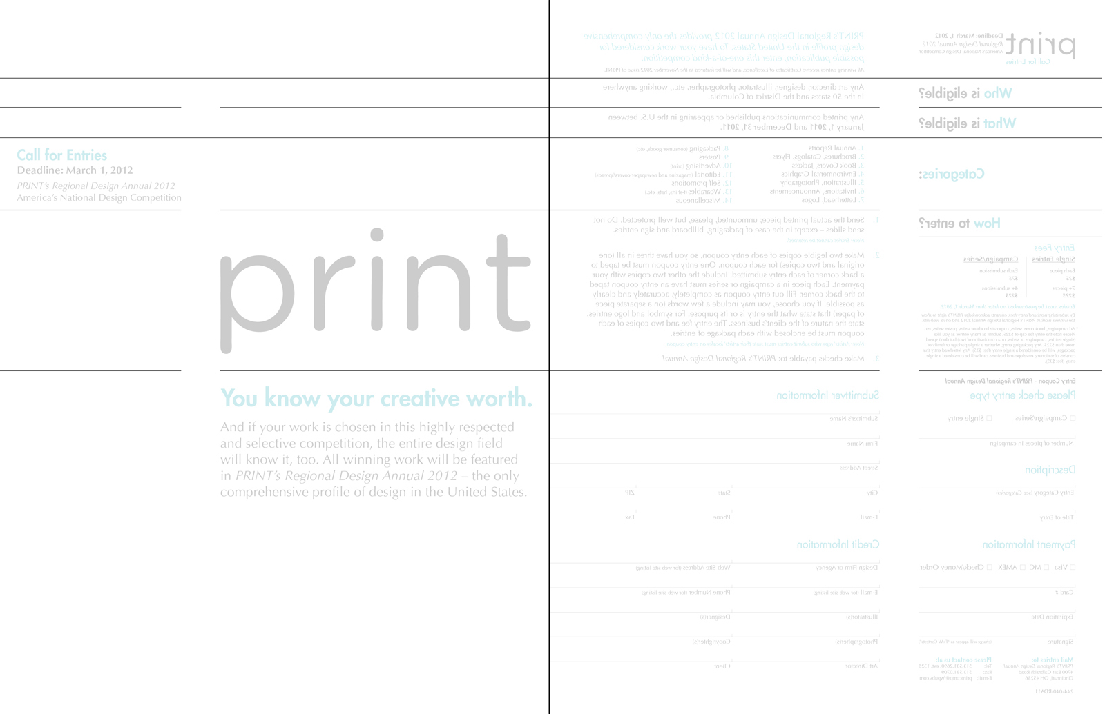
PRINT: Call For Entries
Here I was to design a mock-flyer for the annual PRINT Call For Entries event. For this piece I chose to stick to a very clean and simple design, emphasizing structure, hierarchy, and visual navigation. We were limited to using a maximum of 2 spot colors, and allowed to use screens of each color. The dividing lines are mirrored on both sides of this flyer (as seen in the next image).
Here I designed a mock-flyer for the annual PRINT Call For Entries event, testing my ability to organize a relatively significant amount of information. While the front of this flyer alone is nothing special, I wanted to create a continuation from front to back in order to further emphasize solidarity and consistency within my design. Hierarchy, color, and whitespace are used to break apart sections of information as to provide a clear visual structure.