Literature Redesign
Redesign of Sell Sheets and Literature.
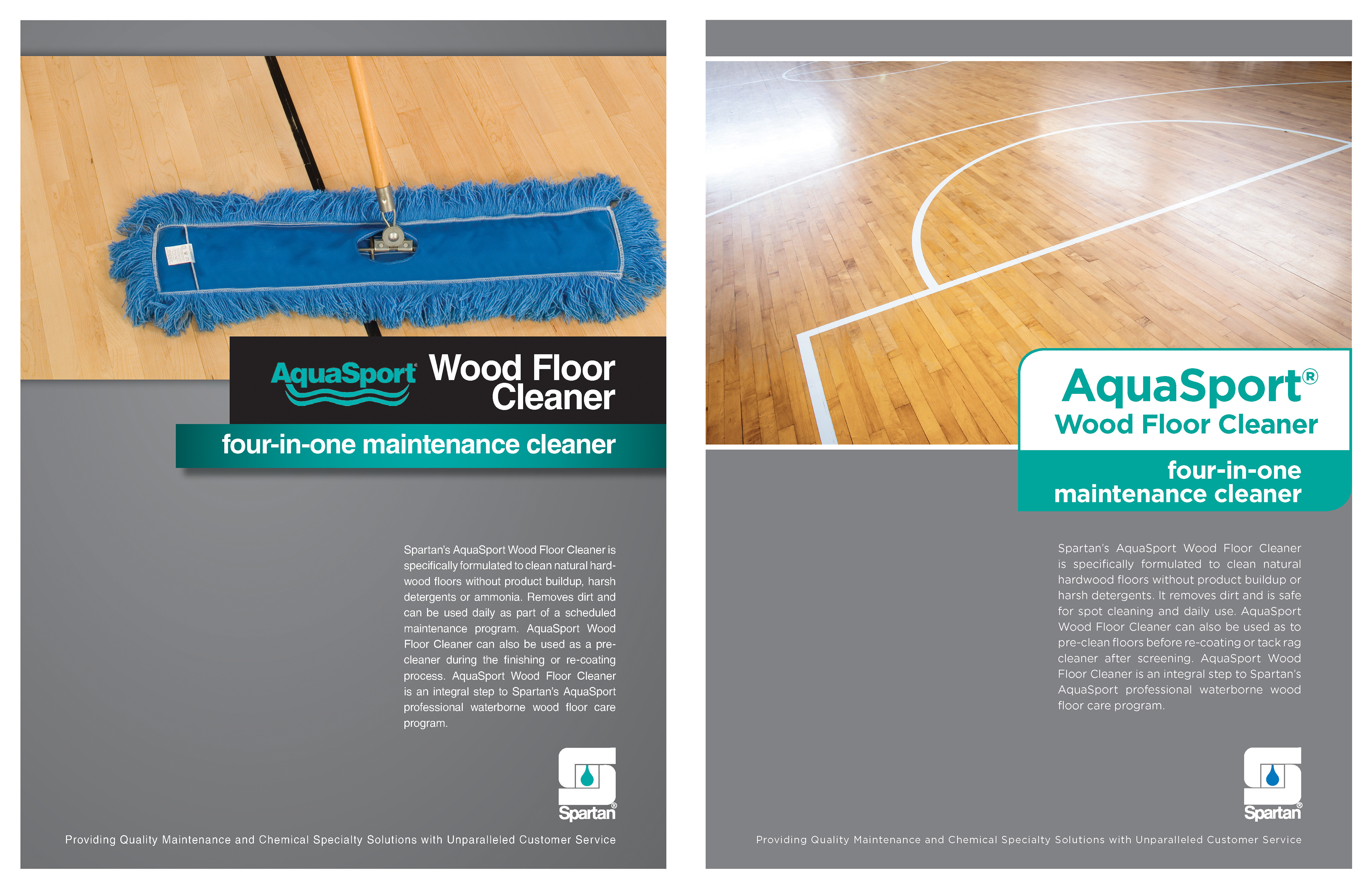
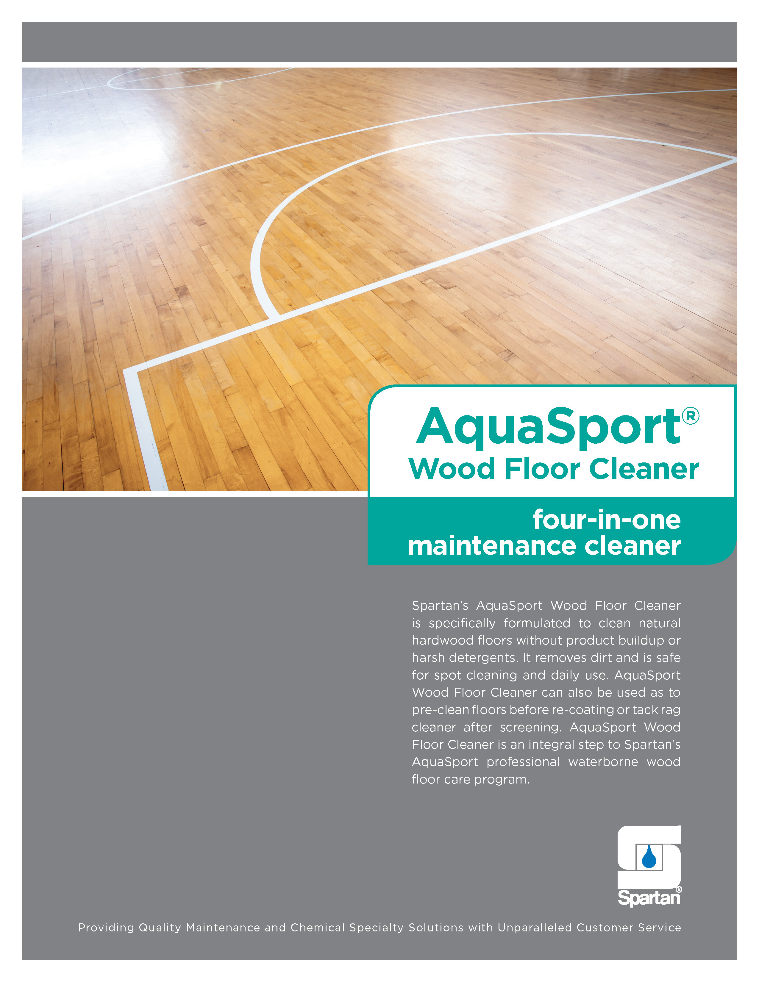
Before
Prior to this redesign, Spartan's Sell Sheets (print pieces on an individual product) and Literature (print pieces on categories/groups of products) were fairly dated-looking and inconsistent, remaining relatively unchanged for 10+ years. They featured a lot of gradients and drop shadows, some odd typesetting choices, and a severe internal branding crime of using the Spartan Block S logo in a way that was grossly manipulated to fit the color scheme.
So with the true realization of the potential branding applications for the Block S shape, a redesign was warranted. It may not be riveting information, but by golly it might as well be presented in the nicest-looking way possible - especially when it can so significantly tie a bow on the new slogan: "We make clean simple."
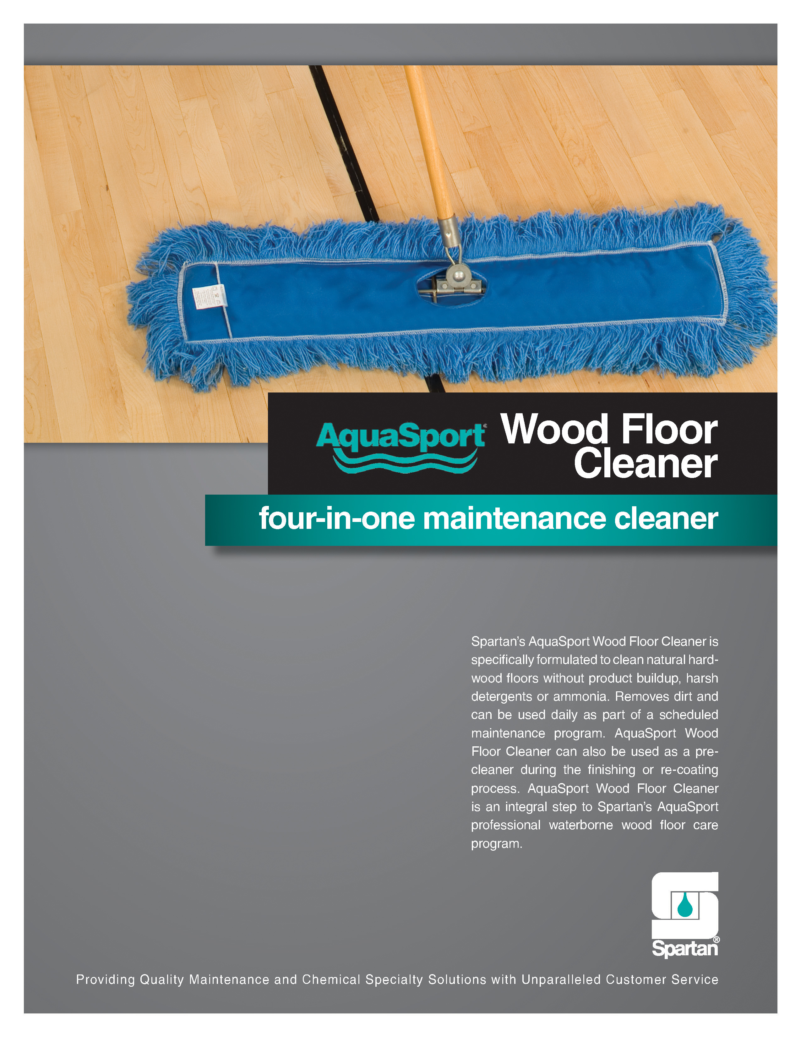
After
The first step (which I likely would have tripped over due to haste and excitement, were it a real, literal "step") was to ditch the gradients and drop shadows. Already it looked infinitely better. The cover photo for this product was swapped out due to the original photo being on every single Sell Sheet in the AquaSport® and WOODFORCE® product lines, and frankly it was bland (not to mention it was an in-process/work photo, while the new end-result photo is quite a bit more appealing on both a visual and emotional aspect).
The Block S shape is used to frame the product name and what it is—effectively separating the information in a way that looks good and makes sense. I removed the black box/color as it really served no purpose, and because all Spartan products have an identifier color this is a prime space to use that identifier. Considering there are 300+ Sell Sheets, the covers should be as different and unique to the product as possible.
Next I simply fixed the logo usage to comply Spartan's Brand Standards.
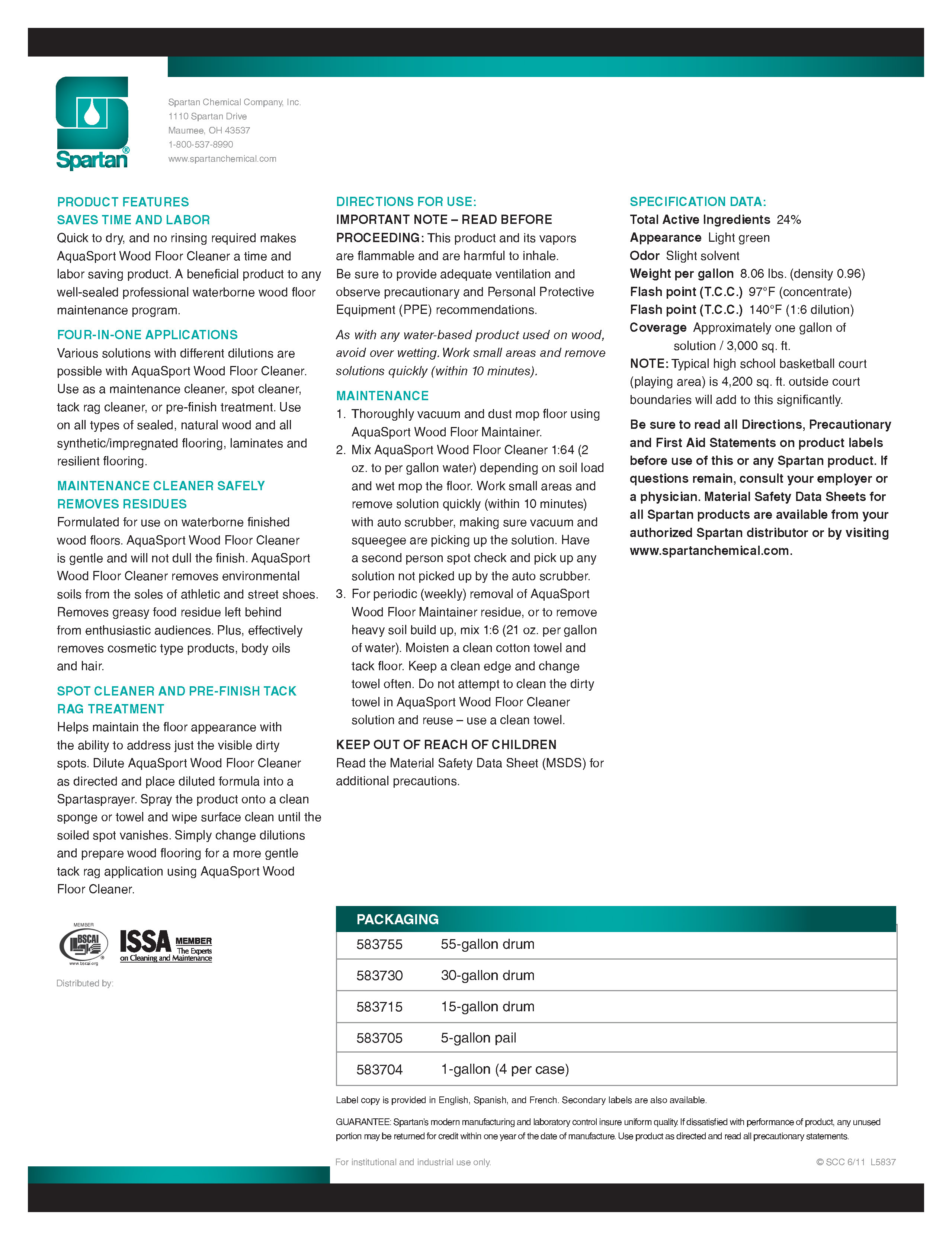
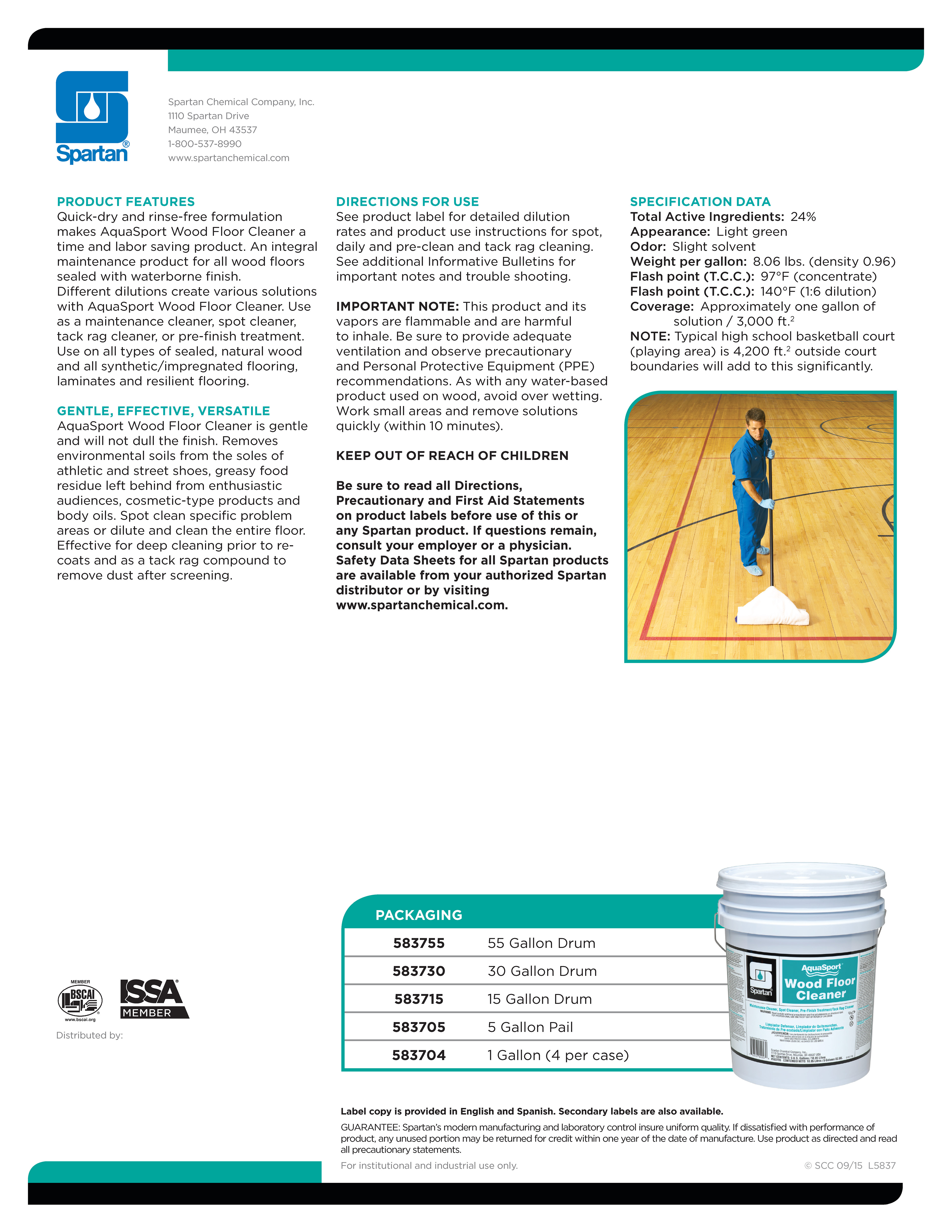
The font has been changed entirely, from Helvetica LT to Gotham. While Gotham is traditionally used in architectural signage and associated with New York City, it's simply a beautiful font—especially when contrasting Roman or Light with Bold. It also looks wonderful in all-caps, and because there's a fair amount of information that needs to be distinguished on the back of the sheet, this is a great benefit.
The typography on the back of the sheet is cleaned up without being overly-meticulous. Once again, there are 300+ of these Sell Sheets and more being added on a regular basis, so there simply isn't the time or resources to nit-pick to the extreme. Character Styles aid tremendously in the templating process, however, so consistency will be maintained.
As for the process photo on the back of this piece, this won't be present on every Sell Sheet simply because there often isn't any room for it. This product is fairly light on the content, so we needed something to spruce it up while also adding some value to the piece.
Side-by-side