Rebranding The Gourmet Grape
For this I chose a company with a weak existing brand identity and recreated it with greater consideration to typographic elements, theory, and detail. The solution is elegant and simplistic, offering a clean and sophisticated feel to a business that aims to cultivate just such an image.

The Gourmet Grape: Rebranding

Logotype
The Gourmet Grape is a wine and gift shop located in downtown Chicago. While there were several obvious directions in which to take a logo redesign, this solution was reached from a simpler, less literal approach. Rather than emphasize the typical bottle/glass/grape/vine as seen in countless other wine shop logos, this was designed to be clean and likable, while playing upon the clever name of the company. Wine is typically known to hold formal connotations, so the colors of the new mark played heavily upon black and white (formal) theme. A splash of burgundy color (PMS 188C) was applied to the bow tie symbol in order to emphasize their specialty (wine), as well as to include a sense of playfulness in an otherwise serious-looking mark. Different styles of Gotham were used for hierarchy of the three words, ranging from Light to Extra Light. This typeface was chosen due to it’s wide range in styles and the overall classic, clean, and architectural structure of each letterform. My initial thought was to go with a simple grape wearing a bow tie, but that just seemed too predictable and untrue to the brand identity.
The Gourmet Grape is a wine and gift shop located in downtown Chicago. While there were several obvious directions in which to take a logo redesign, this solution was reached from a simpler, less literal approach. Rather than emphasize the typical bottle/glass/grape/vine as seen in countless other wine shop logos, this was designed to be clean and likable, while playing upon the clever name of the company. Wine is typically known to hold formal connotations, so the colors of the new mark played heavily upon black and white (formal) theme. A splash of burgundy color (PMS 188C) was applied to the bow tie symbol in order to emphasize their specialty (wine), as well as to include a sense of playfulness in an otherwise serious-looking mark. Different styles of Gotham were used for hierarchy of the three words, ranging from Light to Extra Light. This typeface was chosen due to it’s wide range in styles and the overall classic, clean, and architectural structure of each letterform. My initial thought was to go with a simple grape wearing a bow tie, but that just seemed too predictable and untrue to the brand identity.

Business Card Front
The front of the business card plays to the strengths of the logotype by remaining simple and clean. Because the reverse does not feature the company logotype, it was emphasized here by standing alone.
The front of the business card plays to the strengths of the logotype by remaining simple and clean. Because the reverse does not feature the company logotype, it was emphasized here by standing alone.

Business Card Back
The business card played the strengths of the logotype, utilizing a very simple design as to not overpower the logo. Gotham was used to list the contact information, and colors were used to group two sets of information contained within the card—individual (name, phone number, email) and company (position, web address, physical address) information. The only colors used were black and PMS 188C.
The business card played the strengths of the logotype, utilizing a very simple design as to not overpower the logo. Gotham was used to list the contact information, and colors were used to group two sets of information contained within the card—individual (name, phone number, email) and company (position, web address, physical address) information. The only colors used were black and PMS 188C.
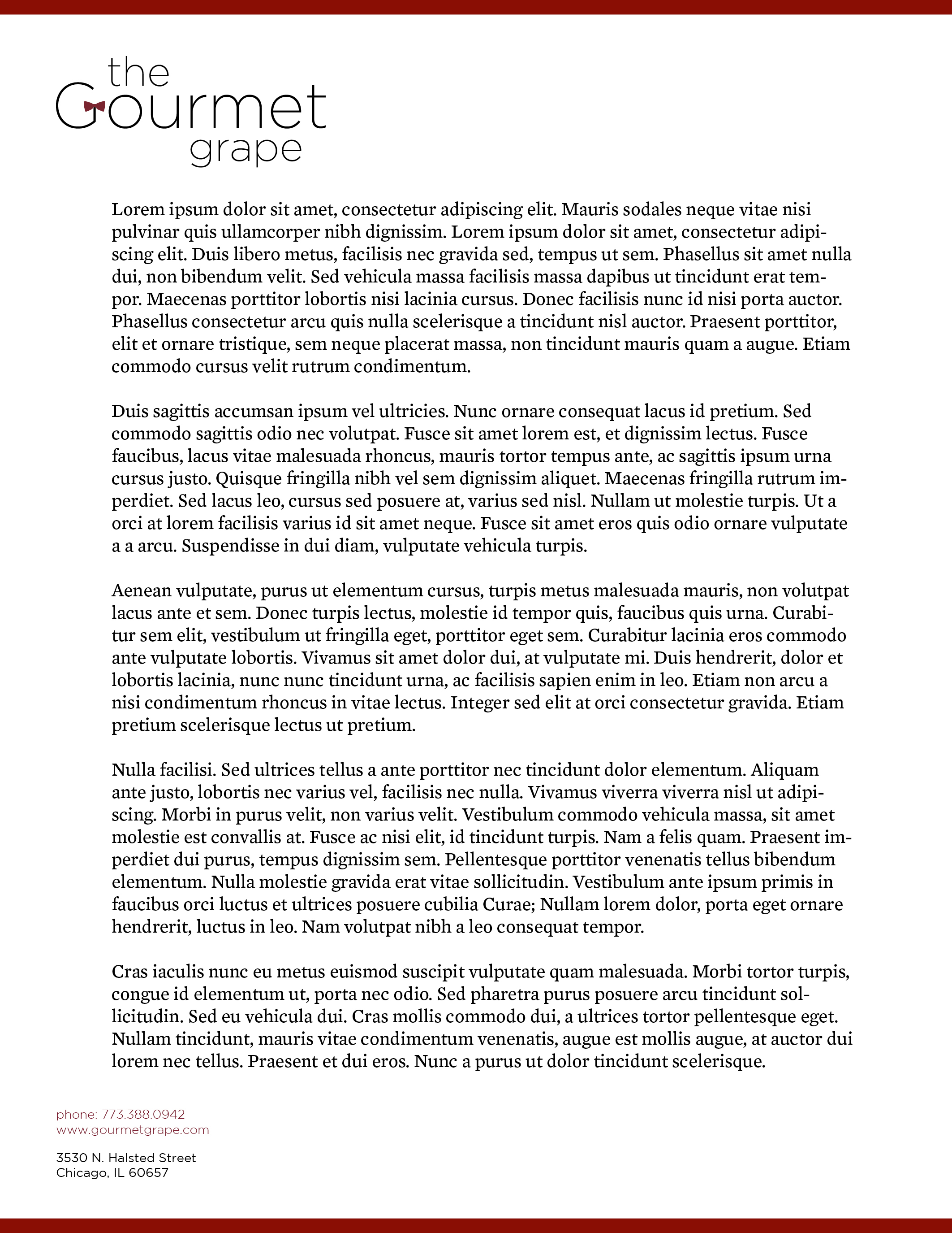
Letterhead
The letterhead design was built to compliment the original business card, utilizing a colored accent border to pop the color of the bow tie within the logo. The logo was placed in the upper lefthand corner, while the contact information was place in the bottom lefthand corner. This was done to allow a subtle visual frame in which to contain the text within the letter. To maintain consistency, the color scheme for information was carried over from the business card, though it was modified according to the content change.
The letterhead design was built to compliment the original business card, utilizing a colored accent border to pop the color of the bow tie within the logo. The logo was placed in the upper lefthand corner, while the contact information was place in the bottom lefthand corner. This was done to allow a subtle visual frame in which to contain the text within the letter. To maintain consistency, the color scheme for information was carried over from the business card, though it was modified according to the content change.

Envelope
Following the look of both the business card and letterhead, the envelope was designed with the same PMS 188C border and emphasis on minimalism. As to comply with normal postal regulations, the address was placed below the company logo in the top lefthand corner of the envelope, and the point size was carefully monitored to be clearly readable at any output.
Following the look of both the business card and letterhead, the envelope was designed with the same PMS 188C border and emphasis on minimalism. As to comply with normal postal regulations, the address was placed below the company logo in the top lefthand corner of the envelope, and the point size was carefully monitored to be clearly readable at any output.


